What is Responsive Website Design?
Responsive Website Design is the process of designing and building a website using techniques that allow the layout of the website to automatically adapt to fit the device it is being viewed on – be it on a desktop computer, a smartphone (such as an iPhone, Blackberry or any brand of phone using the Windows or Android operating system) or a tablet computer (such as iPad, Kindle Fire, Samsung Galaxy Tab or Google Nexus).

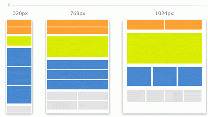
Figure 1: L-R: Smartphone, Tablet and Desktop Layouts
If you view a responsive website on a desktop monitor, you will see a full scaled version of the website. If you then view the same website on a tablet computer or smartphone, the information will automatically rearrange to become stacked, thus enabling you to see a streamlined version (as per Figure 1 above). Responsive websites remove the need for scrolling or panning to access information, thereby improving the user experience and making it easier for a smartphone user to view your content, make an enquiry, or find important information on your website.
How is Responsive Website Design Different To Unique Mobile Websites
The conventional approach of designing for mobile devices has been revolutionised by the advent of Responsive Website Design. Responsive Website Design now allows you to have one website that automatically adapts to the device it is being viewed on. The advantages of Responsive Website Design include:
- Only one website to maintain that displays correctly across all devices
- Reduced development and operational costs
- Only one website address to promote in all of your online and offline marketing material
- Future proofing your website as technology advances
- Better user engagement = higher conversion rates
- Search Engine friendly mobile solution – Responsive Website Design is recommended by Google as the best way to deliver an optimal user experience to smartphone users (see Google’s recommendation below).
Check out the Sony USA and the user-friendly way the menu functions when viewing on a smartphone: https://www.sony.com/.

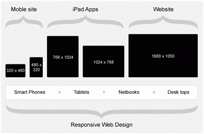
Figure 4: Conventional approach at top vs. Responsive Website Design below
The old approach to providing mobile users with a mobile friendly website results in two websites – one for your desktop site and one specifically for mobile. Although there are times when a separate mobile website would be recommended, we generally recommend the use of Responsive Website Design for the majority of our clients. Disadvantages of the conventional approach include:
-
Maintaining multiple websites increases workload/expense and there is a risk of showing your customers outdated or incorrect information if changes are not applied to all websites
-
Device detection – knowing which version of your website to display depending on which device you are searching from.Device detection is not foolproof and can result in poor user experience
-
Your website will not be future proofed and you may need to invest in multiple websites to ensure they display well on multiple devices
-
Not as Search Engine friendly as Responsively designed websites (see Google’s recommendation below)
Why You Should Consider Responsive Website Design for Your Website
Future Proofing
Responsive Website Design will help to future proof your website as new hardware and technology is released featuring screens of irregular shapes and sizes – the recent development of Smart TVs with built in web browsers should also be taken into consideration.
Increasing Mobile Device Usage
The National Business Review reported in February 2012 that the total of NZ mobile connections across all carriers has topped 5.3 million. Carriers are offering increasingly realistic pricing options for smartphone handsets and monthly plans, which has resulted in a rise in smartphone sales. Browsing the web via mobile phone is rapidly becoming the norm for many New Zealanders.
Google’s Our Mobile World survey (conducted in the 1st Quarter of 2012) has revealed some interesting statistics about New Zealanders increasing smartphone usage and their expectations of how websites should display on mobile devices:
Usage
- 44% of New Zealanders are using smartphones
- Smartphones have become a central part of our daily lives with 46% saying they have used their smartphones everyday in the past 7 days
- 73% don’t leave home without their smartphone
- 59% access the Internet on their smartphones at least once a day
- Smartphones are used everywhere – 97% use them at home, 80% when they are out and about, 76% at work, 64% in a store and 56% at a social gatherings
- 41% are using Search Engines to search for websites and 38% of those users search on their smartphones every day
- Access to the Internet via smartphones will only increase with 35% expecting to use their smartphone more to access the Internet in the future
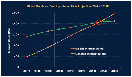
- As per Figure 3 below, it is estimated that by 2015 access via mobile devices will surpass desktop computer usage when connecting to the Internet

Figure 3: Global Mobile vs. Desktop Internet Usage Projection – 2007-2015E
Expectations
- 44% expect websites on smartphones to be as easy to use as on a desktop computer
- Only 13% are completely satisfied with website display when using their smartphone
- 23% will abandon and not come back to view a website if they have a bad mobile user experience.
Doing Business
- 39% of people are looking for local information at least once a week when on a smartphone, with 67% visiting and connecting with that business
- Smartphones have changed the way that consumers shop – 66% have researched a product or service on their phone with 55% of smartphone shoppers making a purchase on their phone in the past month
- Most websites receive between 10-20% of their visits from smartphone or tablet usage.
Although smartphone penetration statistics from surveys will vary depending on sample size, methodology etc, it is clear that smartphone use in NZ is on the rise and it would be prudent for website owners to consider the implications of this rise on their businesses.
Considering these statistics and the speed that technology is developing, it’s vital to make sure your website is dynamic and can adapt to be user friendly on every type and size of device. These numbers are likely to increase year on year as adoption of smart phones increases. As with many online marketing initiatives, it’s the early adopters that often benefit most in the long term. We strongly believe that it’s not the risk of doing it that matters; it’s the risk of not doing it. As quoted by GOMO (a Google Initiative) “Businesses that make mobile a central part of their strategy will benefit from the opportunity to better engage with the new ‘constantly connected consumer’.”
Search Engine Marketing
SEM is an important consideration for anyone considering a mobile website strategy. We believe that Responsive Web Design is the best option for businesses that are active in the online marketing of their website.
Google’s Recommendation
Google have recently announced that they recommend webmasters follow the industry best practice of using Responsive Website Design. They recommend it because:
- Using a single URL for a piece of content makes it easier for your users to interact with, share, and link to your content, and a single URL for the content helps Google’s algorithms assign the indexing properties for the content.
- No redirection is needed for users to get to the device-optimized view, which reduces loading time. Also, user-agent-based redirection is error-prone and can degrade your site’s user experience
- Responsive web design saves resources for both your site and Google’s crawlers. For responsive web design pages, any Googlebot user-agents needs to crawl your pages once, as opposed to crawling multiple times with different user-agents, to retrieve your content. This improvement in crawling efficiency can indirectly help Google index more of the site’s contents and keep it appropriately fresh.
Note: Google also states: “If responsive design is not the best option to serve your users, Google supports serving your content using different HTML. The different HTML can be on the same URL (a setup called dynamic serving) or on different URLs, and Googlebot can handle both setups appropriately if you follow our setup recommendations” They also support “Sites that have separate mobile and desktop URLs” but have stated their recommendation for the reasons mentioned above.
Mobile Search Volume Is Increasing
Over the past couple of years, there has been strong growth in the number of search queries coming via mobile/smartphone devices. A report by BIA/Kelsey (a top US Research & Advisory Company in the Advertising/Media Industry) reports that mobile search is likely to become the preferred and most frequently used method of searching the web by the year 2015. According to this report, in the US, 19.7 billion search queries were coming from mobile search at the end of 2011. By the end of 2012, the company expects mobile queries to approach 31 billion bringing overall search volume beyond 90 billion queries. On analysing our NZ clients traffic stats we too are noticing a rapid growth in search queries via mobile.
One Search Engine Marketing Campaign
A major benefit of Responsive Website Design is the fact that you do not need to invest in multiple Search Engine Marketing campaigns. Campaigns that are currently running can simply be adjusted to accommodate the data that is received regarding mobile traffic to a website.
From a Search Engine perspective, when mobile sites and desktop sites are built separately, each site needs to build up its own set of backlinks in order to acquire the link popularity/authority needed to achieve a good degree of visibility in the search results and drive organic search traffic and enquiries. Having a single website address enables you to benefit from the online presence you’ve built up while still allowing for optimal visibility across various platforms.
Your Competitors
Although many of your competitors may already have a mobile strategy in place, now is the time to put your business ahead of your competitors who haven’t yet considered their mobile users and to gain market share from those that have.
Key Points
- Mobile device usage globally and in NZ is on the rise
- Smartphone usage (as opposed to basic feature phones) is on the increase – smartphones will become the new norm for mobile phones in the future
- Moble search is on the increase – this will result in more traffic to websites which is the very reason why giving your mobile users a good experience is so important
- Mobile users expect concise information at their fingertips and a good website experience for your mobile users will result in higher conversion
- A bad website experience for a mobile user can result in them never coming back to your website in the future
- Responsive Website Design will future proof your website as technology advances
- Responsive Website Design is recommended by Google and having only one website means that you can consolidate your efforts around your Search Marketing campaign
- Now is the time to put yourself ahead of your competitors or to gain market share from those that alreasy have mobile strategies in place
Talk to us today about developing a mobile strategy for your website.
Feel free to drop a comment below – we’d love to hear your thoughts.
